

EDEN SUPPER CLUB
Primary logo
The upside down apple is a nod to the orgin story of the garden of Eden. The apple specifically was the forbidden fruit, and the upside down version represents it falling between the good and evil, the good of what Eden brings to the restaurant industry vs the toxic energy often found in the kitchen. The apple is in neither hand, only resting, so it sits neutrally. The apple could be used for bad or good as a demonstration of balance, yin & yang. Eden’s brand aims to create a safe space for chefs and food lovers.


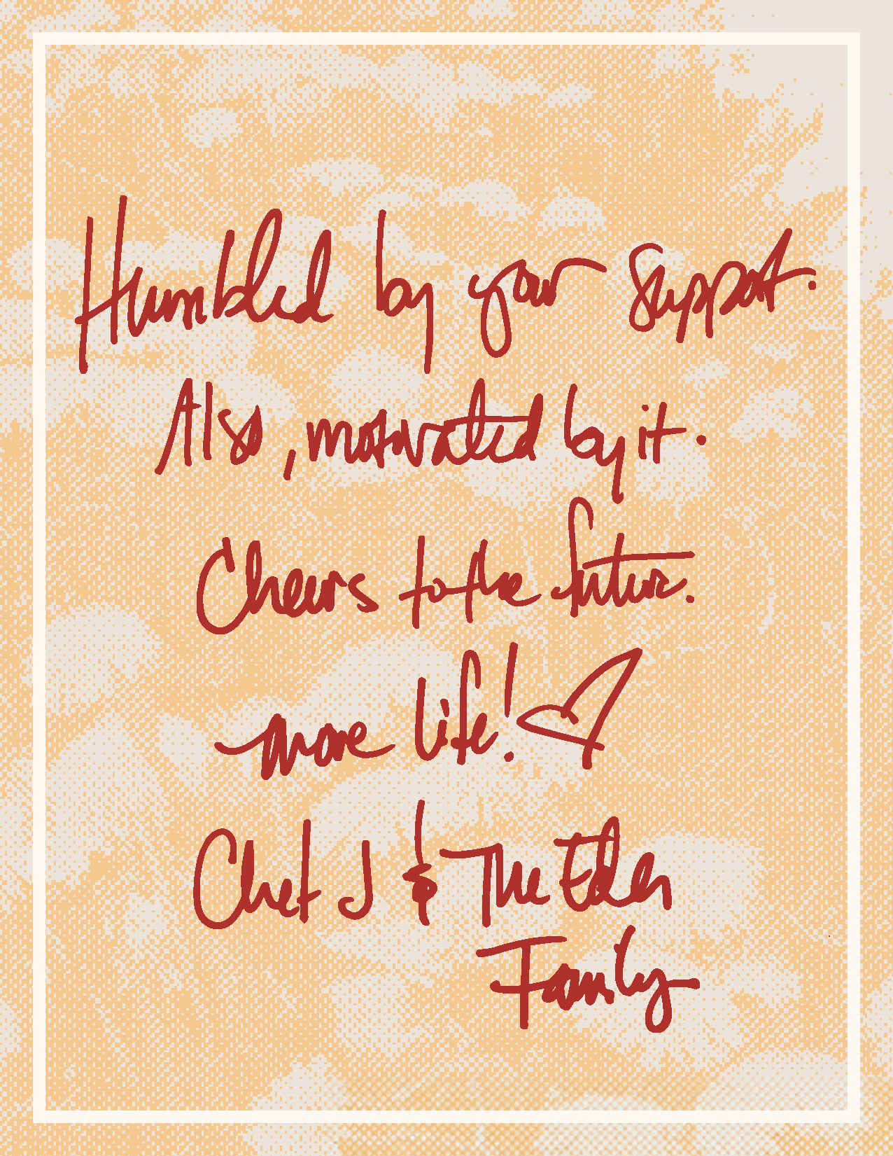

A night at Brochu's will be an opportunity for us at Eden to be vulnerable. Making food that fills our cups, and hopefully your bellies. Food for conversation. Influenced by the kitchen table, a place to share. Inspired by the richness of France, paired with the openness of Spain. Food that makes you want more food, more wine, and more connection.
Nothing complicated.
Well executed, with love and attention.
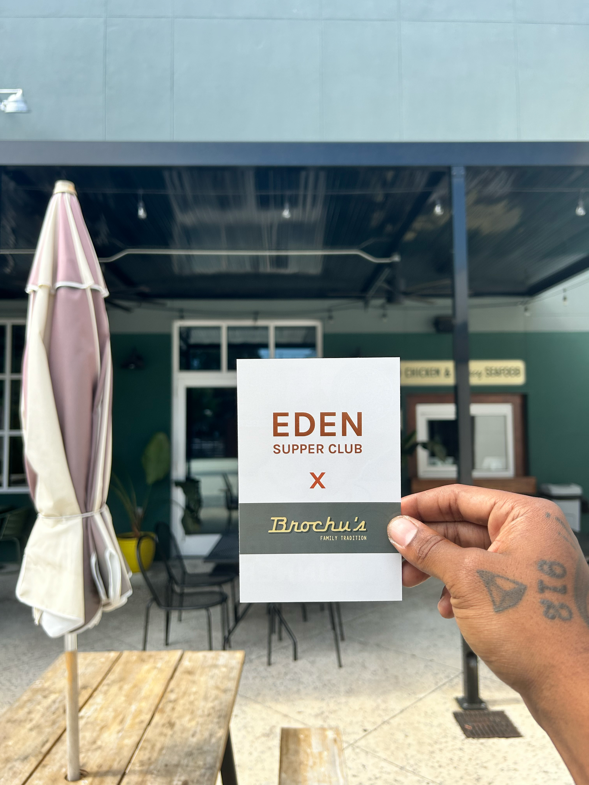
EDEN X Brochu’s


EDEN X Chuck’s
A private dinner brought together strangers from all walks of life to Chuck’s on the Water, where EDEN Supper Club curated an intimate menu beginning with oysters on the dock and fine wine selected by a beloved local wine bar. What started as simple introductions unfolded into insightful conversations and thoughtful connections, shaped by shared plates, stories, and the quiet magic of the table.
Featuring menu and advertisement design
All images credited to Robin Birdy
Merchandise
The merchandise was inspired by nostalgia as the designs nod to the idea of memory. The warm feeling people get when eating grandmas pie or dads classic ribs. As soon as you smell it and taste it, it brings you back to another time, reminds you of that memory and feeling. The client wanted Eden to feel familiar even if you have never heard of it before. The merchandise coaxes a feeling of nostalgia for customers while introducing Eden’s brand, together, working in unity.


Brand Guideline Book
The brand book includes the color palette, primary/secondary/tertiary logo with their misuses, color variations per logo, and recommended fonts.
