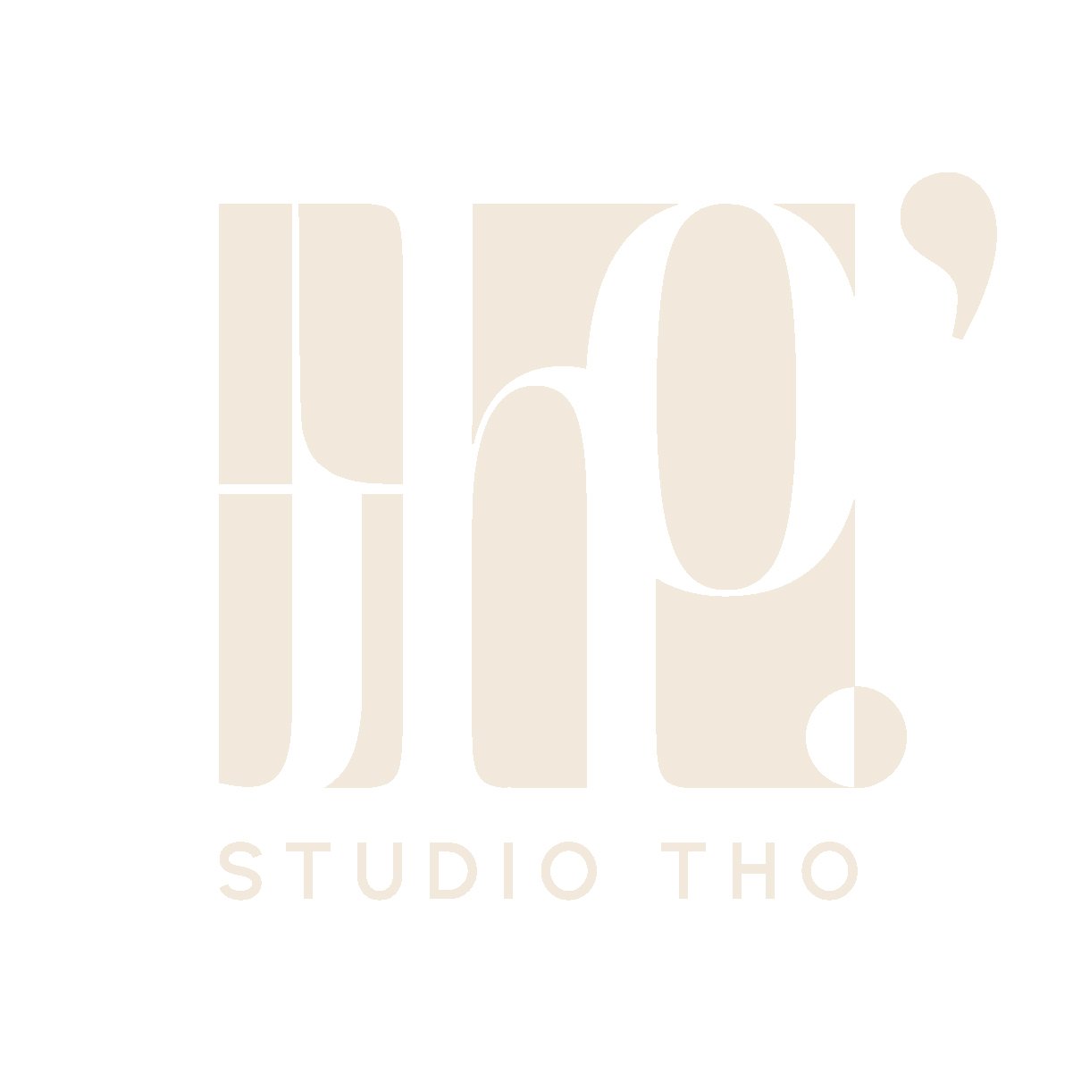
STUDIO THO.’
The client came to me with a detailed explanation of the name of their studio, why it’s important and how they wants to utilize the meaning within the foundations of the studio. It was my job to create a brand identity that encapsulated all of the clients ideas into their studios logo.
STUDIO THỌ is named after the clients muse, their grandmother Thọ, which translates to longevity in Vietnamese.
STUDIO THO’, implies a differentiator as in is it too extra tho’? or is it too rebellious tho’?
These different meanings for STUDIO THỌ’ were important to the client and the brands mission. The studio will bring a new perspective of your space to light. Surprising clients, while bringing LONGEVITY to all projects.
Secondary Logo
The secondary logo, the wordmark, utilizes the period and apostrophe in a different way than traditionally used. This demonstrates the studios diversity in ideas, uniqueness, and universal quality.
Brand Guideline Book
The brand book includes color palette, primary/secondary logo and their misuses, color variations per logo, and recommended fonts.


